The Python Book
All — By Topic
2019 2016 2015 2014
angle
argsort
beautifulsoup
binary
bisect
clean
collinear
covariance
cut_paste_cli
datafaking
dataframe
datetime
day_of_week
delta_time
df2sql
doctest
exif
floodfill
fold
format
frequency
gaussian
geocode
httpserver
is
join
legend
linalg
links
matrix
max
namedtuple
null
numpy
oo
osm
packaging
pandas
plot
point
range
regex
repeat
reverse
sample_words
shortcut
shorties
sort
stemming
strip_html
stripaccent
tools
visualization
zen
zip
3d aggregation angle archive argsort atan beautifulsoup binary bisect class clean collinear colsum comprehension count covariance csv cut_paste_cli datafaking dataframe datetime day_of_week delta_time deltatime df2sql distance doctest dotproduct dropnull exif file floodfill fold format formula frequency function garmin gaussian geocode geojson gps groupby html httpserver insert ipython is join kfold legend linalg links magic matrix max min namedtuple none null numpy onehot oo osm outer_product packaging pandas plot point quickies range read_data regex repeat reverse sample sample_data sample_words shortcut shorties sort split sqlite stack stemming string strip_html stripaccent tools track tuple visualization zen zip zipfile
Convert a Garmin .FIT file and plot the heartrate of your run
Use gpsbabel to turn your FIT file into CSV:
gpsbabel -t -i garmin_fit -f 97D54119.FIT -o unicsv -F 97D54119.csvPandas imports:
import pandas as pd
import math
import matplotlib.pyplot as plt

pd.options.display.width=150
Read the CSV file:
df=pd.read_csv('97D54119.csv',sep=',',skip_blank_lines=False)Show some points:
df.head(500).tail(10)


      No   Latitude  Longitude  Altitude  Speed  Heartrate  Cadence        Date      Time
490  491  50.855181   4.826737      78.2   2.79        144     78.0  2019/07/13  06:44:22
491  492  50.855136   4.826739      77.6   2.79        147     78.0  2019/07/13  06:44:24
492  493  50.854962   4.826829      76.2   2.77        148     77.0  2019/07/13  06:44:32
493  494  50.854778   4.826951      77.4   2.77        146     78.0  2019/07/13  06:44:41
494  495  50.854631   4.827062      78.0   2.71        143     78.0  2019/07/13  06:44:49
495  496  50.854531   4.827174      79.2   2.70        146     77.0  2019/07/13  06:44:54
496  497  50.854472   4.827249      79.2   2.73        149     77.0  2019/07/13  06:44:57
497  498  50.854315   4.827418      79.8   2.74        149     76.0  2019/07/13  06:45:05
498  499  50.854146   4.827516      77.4   2.67        147     76.0  2019/07/13  06:45:14
499  500  50.853985   4.827430      79.0   2.59        144     75.0  2019/07/13  06:45:22
Function to compute the distance (approximately) :
#  function to approximately calculate the distance between 2 points
#  from: http://www.movable-type.co.uk/scripts/latlong.html
def rough_distance(lat1, lon1, lat2, lon2):
    lat1 = lat1 * math.pi / 180.0
    lon1 = lon1 * math.pi / 180.0
    lat2 = lat2 * math.pi / 180.0
    lon2 = lon2 * math.pi / 180.0
    r = 6371.0 #// km
    x = (lon2 - lon1) * math.cos((lat1+lat2)/2)
    y = (lat2 - lat1)
    d = math.sqrt(x*x+y*y) * r
    return d
Compute the distance:
ds=[]
(d,priorlat,priorlon)=(0.0, 0.0, 0.0)
for t in df[['Latitude','Longitude']].itertuples():
    if len(ds)>0:
        d+=rough_distance(t.Latitude,t.Longitude, priorlat, priorlon)
    ds.append(d)
    (priorlat,priorlon)=(t.Latitude,t.Longitude)

df['CumulativeDist']=ds
Let's plot!
df.plot(kind='line',x='CumulativeDist',y='Heartrate',color='red')
plt.show() 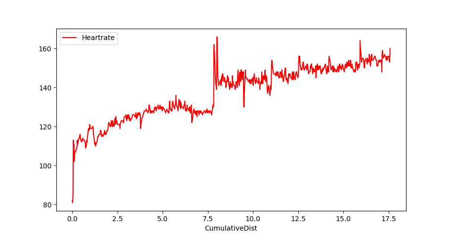
Or multiple columns:
plt.plot( df.CumulativeDist, df.Heartrate, color='red')
plt.plot( df.CumulativeDist, df.Altitude, color='blue')
plt.show()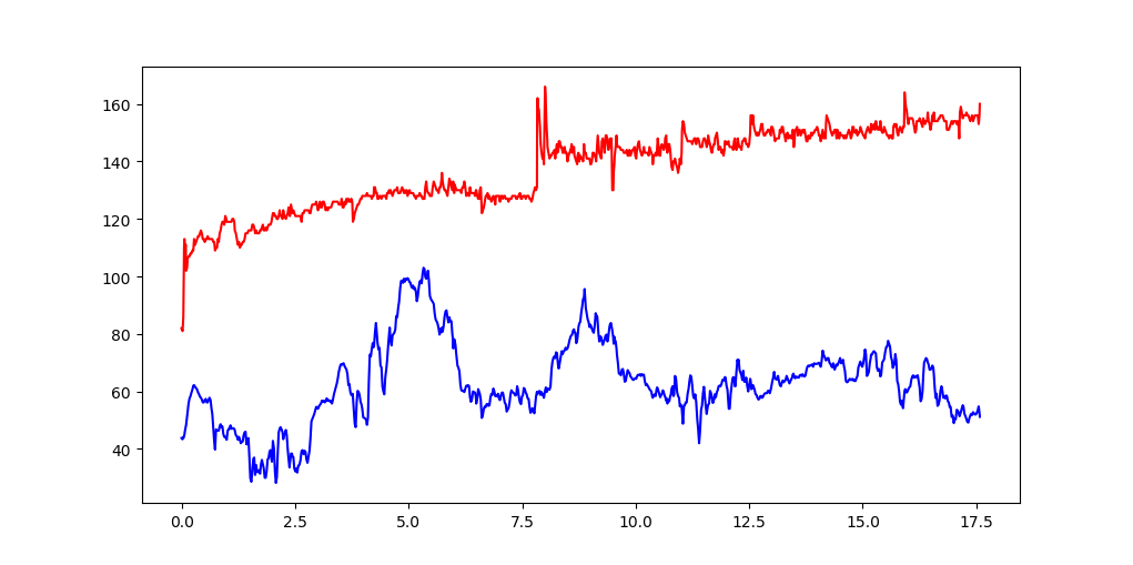
Pie chart
Make a pie-chart of the top-10 number of cities per country in the file cities15000.txt
import pandas as pd
import matplotlib.pyplot as plt
Load city data, but only the country column.
colnames= [ "country" ]
df=pd.io.parsers.read_table("/usr/share/libtimezonemap/ui/cities15000.txt",
                sep="\t", header=None, names= colnames,
                usecols=[ 8 ])
Get the counts:
cnts=df['country'].value_counts()

total_cities=cnts.sum()
22598
Keep the top 10:
t10=cnts.order(ascending=False)[:10]

US    2900
IN    2398
BR    1195
DE     986
RU     951
CN     788
JP     752
IT     674
GB     625
FR     616
What are the percentages ? (to display in the label)
pct=t10.map( lambda x: round((100.*x)/total_cities,2)).values

array([ 12.83,  10.61,   5.29,   4.36,   4.21,   3.49,   3.33,   2.98, 2.77,   2.73])
Labels: country-name + percentage
labels=[ "{} ({}%)".format(cn,pc) for (cn,pc) in  zip( t10.index.values, pct)]

['US (12.83%)', 'IN (10.61%)', 'BR (5.29%)', 'DE (4.36%)', 'RU (4.21%)', 'CN (3.49%)',
 'JP (3.33%)', 'IT (2.98%)', 'GB (2.77%)', 'FR (2.73%)']
Values:
values=t10.values

array([2900, 2398, 1195,  986,  951,  788,  752,  674,  625,  616])
Plot
plt.style.use('ggplot')
plt.title('Number of Cities per Country\nIn file cities15000.txt')
plt.pie(values,labels=labels)
plt.show()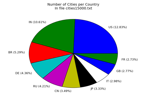
Plot a couple of Gaussians
import numpy as np
from math import pi
from math import sqrt
import matplotlib.pyplot as plt


def gaussian(x, mu, sig):
    return 1./(sqrt(2.*pi)*sig)*np.exp(-np.power((x - mu)/sig, 2.)/2)

xv= map(lambda x: x/10.0, range(0,120,1))

mu= [ 2.0, 7.0, 9.0 ]
sig=[ 0.45, 0.70, 0.3 ]

for g in range(len(mu)):
    m=mu[g]
    s=sig[g]
    yv=map( lambda x: gaussian(x,m,s), xv )
    plt.plot(xv,yv)

plt.show()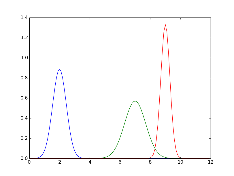
Plot with simple legend
Use 'label' in your plot() call.
import math
import matplotlib.pyplot as plt

xv= map( lambda x: (x/4.)-10., range(0,81))

for l in [ 0.1, 0.5, 1., 5.] :
    yv= map( lambda x: math.exp((-(-x)**2)/l), xv)
    plt.plot(xv,yv,label='lambda = '+str(l));

plt.legend()
plt.show()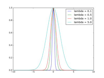
Sidenote: the function plotted is that of the Gaussian kernel in weighted nearest neighour regression, with xi=0
A good starting place:
matplotlib.org/mpl_toolkits/mplot3d/tutorial.html
Simple 3D scatter plot
Preliminary
from mpl_toolkits.mplot3d import axes3d
import matplotlib.pyplot as plt
import numpy as np
Data : create matrix X,Y,Z
X=[ [ i for i in range(0,10) ], ]*10
Y=np.transpose(X)

Z=[]
for i in range(len(X)):
    R=[]
    for j in range(len(Y)):
        if i==j: R.append(2)
        else: R.append(1)
    Z.append(R)
X:
[[0, 1, 2, 3, 4],
 [0, 1, 2, 3, 4],
 [0, 1, 2, 3, 4],
 [0, 1, 2, 3, 4],
 [0, 1, 2, 3, 4]]
Y:
[[0, 0, 0, 0, 0],
 [1, 1, 1, 1, 1],
 [2, 2, 2, 2, 2],
 [3, 3, 3, 3, 3],
 [4, 4, 4, 4, 4]])
Z:
[[2, 1, 1, 1, 1],
 [1, 2, 1, 1, 1],
 [1, 1, 2, 1, 1],
 [1, 1, 1, 2, 1],
 [1, 1, 1, 1, 2]]
Scatter plot
fig = plt.figure()
ax = fig.add_subplot(111, projection='3d')
ax.scatter(X, Y, Z)
plt.show()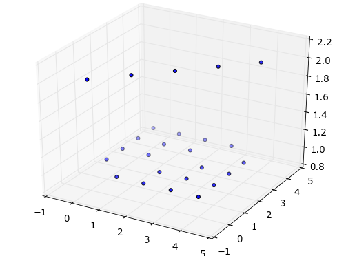
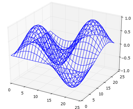
Wireframe plot
1 2 3 4 5 6 7 8 9 10 11 12 13 14 15 16 17 18 19 20 21 22 23 | |
Plot a function
eg. you want a plot of function: f(w) = 5-(w-10)² for w in the range 0..19
import matplotlib.pyplot as plt

x=range(20)
y=map( lambda w: 5-(w-10)**2, x)
plt.plot(x,y)
plt.show()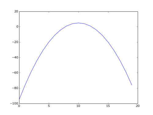
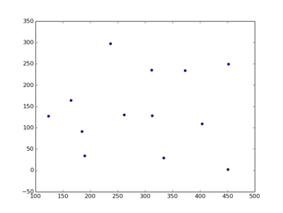
Plot some points
Imagine you have a list of tuples, and you want to plot these points:
l = [(1, 9), (2, 5), (3, 7)]And the plotting function expects to receive the x and y coordinate as separate lists.
First some fun with zip:
print(l)
[(1, 9), (2, 5), (3, 7)]

print(*l)
(1, 9) (2, 5) (3, 7)

print(*zip(*l))
(1, 2, 3) (9, 5, 7)
Got it? Okay, let's plot.
plt.scatter(*zip(*pl))
plt.show()